Archive for Kerning

Pope Francis' tombstone

Designers Do a Double Take at the Lettering on Pope Francis’ Tombstone
Irregularly spaced letters spelling “F R A NCISC VS” have caused a stir among typography nerds who specialize in spacing and fonts. One called them “an abomination unto design.”
By Adeel Hassan, NYR (5/4/25)

It seems a small matter to get exercised over, but then it's the pope, after all, and for those who care about it, kerning is a serious business.

The simple slab has only 10 letters, but the spacing between them can make it read like “F R A NCISC VS.”

Read the rest of this entry »
Comments (13)

ISTORMI IDRAINI

Comments (18)

Serif or sans serif?

Most people care about their typefaces

Appearances matter, especially whether fonts have serifs or not.

"Font Wars Spread After State Department Replaces Times New Roman with Calibri

"'I'm banging my head against the wall;' camps divided in fallout from government efforts to make documents easier to read"

By Katie Deighton, WSJ (3/14/23)

One wonders whether it is a matter of functionality and efficiency or esthetics and taste.  Whatever motivates the confrontation, one thing is evident, and that is that people have deeply held opinions in favor of / against one side or the other.

What sounds like a typeface tempest-in-a-teapot has boiled over in the U.S. and U.K., where changes in document requirements have set off a war of words among cantankerous font factions.

The State Department announced in January that Calibri would replace Times New Roman on official documents to make them easier to read. U.K.’s Home Office, for similar reasons, x-ed out the 83-year-old Times New Roman, which has the wings and feet on letters known as serif style.

Read the rest of this entry »

Comments (26)

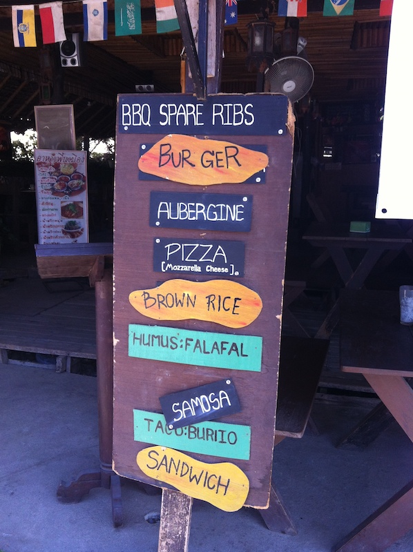
Bur Ger A Head: Thai fondness for English syllabism

The following portfolio of photographs illustrating the Thai penchant for separating English words into syllables was taken by Paul Midler over many years of travel in the region:

Read the rest of this entry »

Comments (18)

Spacing within words

Speaking of spaces between syllables (but, as in this case, not all syllables), as we have been in recent posts, this photograph of a sign in China was sent in by Paul Midler:

But the lettering is very nice!

Comments (8)

Two instances of orthographic ambiguity: GODISNOWHERE and Chen Fake

Comments (9)

Do what to the switch?

Quick! What does it say?

Read the rest of this entry »

Comments (17)