Anecdotally, I did a website recently for a carpet cleaner. Standard wordpress job with his services and things. At the top of the home page, he wanted a link to a form for redeeming living social coupons, which, not wanting to say "Click Here for", I just made as "Reedem Living Social Coupon".
It turned out after a couple weeks that many of his users were not clicking "Reedem Living Social Coupon", but clicking the "Contact Us" link. As a quick fix, I renamed the link to "Click Here to Redeem Living Social Coupon" and bolded the text. He mentioned a week later that this had a noticeable improvement in people clicking the correct form.
People who use the web for scheduling carpet cleanings are not always the same as the twitter crowd. You need to remember who your audience is, not what all your programmer friends prefer.
(And for some closure, I ended up adding a "coupon code" optional entry on the generic contact form for people who still clicked the wrong one anyway.)
My cofounder has had similar experiences. I don't have the data handy, but last time I grumbled about a "click here" he told me about a couple of times he A/B tested it and got substantial wins.
I still wouldn't use "click here" in normal writing (e.g., a blog post); I think it's unnecessary and a bit gauche. But I'm happy to do it on landing pages and other places where I really do want people to click there.
I think the article applies to "normal" website content, e.g. body text, articles, etc.
Landing pages, big call-to-actions, etc. are a different beast entirely. Especially because it's not always obvious what's a graphic or a link, what's a headline or a link. "Click here" makes it obvious, which is necessary when dealing with anything is not "standard" page content.
Maybe it was too much text. Once you get over 2 words, the less it looks and feels like a button to someone in a hurry. "Reedem Living Social Coupon" may have just been too long, maybe "Redeem Now!" may have been better.
Is it? It's tough to say whether the wording was the problem in your case without seeing the site though. Was the link visibly clickable? Was it a button? What would happen if it was a button and it had a Living Social logo on it? Bold text calling out to click sounds more visible and enticing, but there are other ways to grab users' attention.
Yes, you can print an A3 sized sign to remind visitors to flush the toilet, bolding, italicizing and underlining the text to get their attention. Or you can make a clever doodle or an icon, and make it fit into the bathroom's interior design.
You want your call-to-action verb to match the verb in the user's mind when they visit the site, or they may not recognize it as the action they wanted and skip over it.
I'd guess that people think of coupons as something you "use" more than "redeem", so maybe that'd be a better verb.
But – since it can be tricky to get inside your users' heads like that, I prefer to phrase links like this as a question, like "Have a Living Social coupon?" That way there's much less potential for a mental-model mismatch.
I've tried to abide by this rule for most of the 17 years I've done web development. There is, however, an exception to this rule: My mom.
My mom (and my dad) belong to the group that - even after a decade of daily computer use - frequently fail to recognize distinct interface elements. They seem to have no general concept of the look / purpose of a link, a window, a modal box etc. Colors and chrome are meaningless to them, but text that says 'click here' is the best of UX there can be.
I've noticed that many web publications that cater to non-savvy users tend to stick with the 'click here'-pattern.
As a matter of fact I spoke to your parents the other day. They asked me if there was a space between the first and second word of my ___domain name. They also didn't understand that you can't just send an email to domainname you need an address at domainname. They didn't know what a browser bar was they just type my ___domain name in google and go from there.
In all seriousness you raise an excellent point.
It would be interesting if there was some data and metrics to backup the web saavyness of various audience types and how a particular link style impacts those groups. What works with one group might be a detriment in another group.
I think in general, if you are targeting the "general public" or an audience you know is probably not tech-savvy, you're better off with links that say "Click Here" or actually using buttons.
I came here just to say this. UI is a learned behavior and if you're a beginner any explicit sign or help indicating what to do next is very much welcomed.
... and if you're a beginner any explicit sign or help indicating what to do next is very much welcomed.
What's interesting is the the OP's parents have been using computers for a decade. They're not beginners per se, but they seem (I'm guessing) to have internalized some UI artifacts from the Web of 10 years ago.
If this is the case then the problem is not helping people who are beginners, but helping people who have possibly stopped reconsidering the UI they are actually seeing and who instead are locked into habits they built up earlier.
Neither of my parents (both college-educated with multiple graduate degrees) ever really "got" GUIs or the web. They learned computing with punch cards and later with teletypes and vt100 terminals. They were fine with DOS when PCs came on the scene, but just never really made the leap to graphical interfaces and the web. My dad in particular thought it was all a bunch of silliness and it actually contributed to his loss of interest in computing (he used to program Z80s in assembly to control laboratory equipment. He could also progam TI 980 minicomputers by toggling machine code in on the front panel. But he never saw the point of the web.
Sigh. Reminds me of my (late) mother, who would accidentally click on the "Subject" header in Outlook (causing messages to be sorted by subject) and have no idea what happened or why messages were no longer sorted in the order they arrived.
She would call me saying her email "looks all different" for "no reason"
appears to offer more user-friendly advice (perhaps because it is based on more thorough usability research) than the advice in the article kindly submitted here.
This is a fantastic article, and the first time I've ever come across anything addressing these issues.
The only thing I don't entirely agree with is:
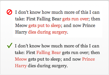
1) Wrong: "first Falling Bear gets run over"
2) Right: "first Falling Bear gets run over"
I think they're just different. In the first case, I expect a link to to a photo of Falling Bear as he's getting run over. In the second case, I expect a link to a page on Falling Bear, that may have nothing to do with when he was run over.
I'd tag the whole phrase. It's not "Falling Bear" and it's not "gets run over", it's "Falling bear gets run over". That creates a rather large link, but, hey! Fitt's Law and SEO!
I think Wikipedia has done a first class job of destroying peoples trust into "nouns as links". They mention a blog entry in a Wikipedia article, but of course clicking blog just takes you to the Wikipedia article on blogs, instead of the actual blog in question (which you then have to find through the references).
I bet the more common and more frustrating experience has been the ad services that auto-inject hover-ads into common nouns, such as "loans" or "books"
Their point is that the link anchor should describe what's happening at the endpoint. I agree, a generic noun doesn't always describe it. "Falling Bear" doesn't say the same thing as "Falling Bear getting run over."
From Aristotle to OOP, there's a long history of over-reliance on nouns to describe the world around us. Unfortunately a full and nuanced description requires an explanation of both object and action.
Exactly - I prefer links on the verbs when it comes to referencing individual events. Nouns should be used for more general information concerning the topic that isn't necessarily related to a particular incident/event.
One thing I noticed about this example is how links are also emphasisers. Emphasising the nouns instead of verbs made this paragraph easier to read for me.
The problem is that the article seems to give advices based on the personal opinion of the author and has no data to test his theories. By testing different versions on my web sites I often got better results from "ugly formulations" like "click here to order" than something "pure" that has no call to action. What I found was the most important is that the context must be clear and descriptive of what the user will find the other side of the link but also contain some call to action.
I think this may be an important point, but it makes me wonder if "click here to order" would be less effective than "order today." Certainly the latter contains a call to action and perhaps a better one. Again it's a question but one which I have not studied in terms of user behavior.
IMHO introducing a time dimension might be contrary to the goal. 'today' means later in the day perhaps (==never, acutally). You could use 'now', but it would still induce a reflection on doing it now or not. Just 'order here' feels like less to parse and less ways it could go wrong.
I agree with almost everything in this post, philosophically and intellectually. However, any usability study I remember seeing on this subject has always concluded that "click here" converts better. So until they back up any of their suggestions with data, this article gets relegated to pure brain fodder.
Edit: And I'm sure conversions would probably also depend on the demographics of your user base, so I'd be interested in seeing that included as well.
How do we change these behaviors if we don't lead users to it as an industry? Do you want to make the web a better place or just raise your conversion rate? I don't know if there is a "right" answer.
I think its pretty arbitrary to claim that "changing these behaviors" would "make the web a better place".
I think if people think and react in a certain way, there is nothing wrong with that, and web design should evolve around how people act as opposed to the other way around.
Then again I don't work in either any sort of UX or web development, so maybe I should keep my mouth shut here :)
To what extent do you think its possible to change behaviors like this? That is to say, to what extent do you believe people's reaction to this sort of stuff are innate human behaviors and reactions, and how much is learned through interactions to UIs and can be relearned?
And I agree, I don't see how changing the behaviors would make the world a worse place, but I think if you want to make a case for having the entire industry lead users to certain behavior patterns, an argument should be made for why this is actually improving the web, beyond one person's aesthetic preferences.
It is hubris to think that your users should change for you. Usability is about adapting computers to fit humans not changing humans to fit someone's definition of "right".
I've run a bunch of tests on this with 100,000+ email users. In nearly every test, we found that varying the copy of the text link from "Click Here" to "Join Now" or "Get the Video" or "Buy Now" or a bunch of other copy...made almost no difference.
I think this example (http://uxmovement.com/wp-content/uploads/2012/06/clickhere_n...) is absolutely awful. Many websites style text in many ways, if you're going to refuse to have "click here" (or any other call to action) then you absolutely must stick to common patterns: links being blue and underlined.
Good post, but it would be more convincing with data. At this point, it seems like the blog post is based on your intuition. None of us have great intuition as to what 90% of web users are doing.
I agree, there are a lot of things here that come off as just opinion or speculation but doesn't give any reasons for why that hold up to firm scrutiny. An example:
* Doing so diminishes their experience of your interface because it momentarily takes their focus away from it. Instead of focusing on the interface and its content, “click here” diverts their attention to the user and their mouse. Not to mention, you can also make them feel dumb by suggesting that they don’t know what a link is or how to use a mouse.*
Based on what? At this point in time, very few people think about the actual action of moving a mouse and clicking a link, they just do it. It is now an innate action
however
you have to keep your audience in mind here. That second paragraph about making your audience seem dumb? Well what about the group of people who almost never use a computer, the elderly or those who are just not around machines as often? They might read a linked word and think it's something completely different. Telling them to click here engages in the mind "There is more relevant information on the next page".
It's more than just links. Anything you want the user to interact with should be self-explanatory.
Buttons shouldn't say yes/no or ok/cancel. They should describe the actual action. "Leave this page" or "stay on this page", "Remove from cart" or "keep in cart", and so on.
I'm not convinced -- I find the Vista dialogs really confusing for that reason.
First, I read the question, "Do you want to save this file?"
Then I naturally expect "Yes", "No", "Cancel" -- effortless to understand.
If I see "Save this file", "Don't save this file", "Return to application", it takes a lot longer, because I have to parse each button, which is redundant and annoying since I' already parsed the question.
The only time I've found longer button names to be useful are in rare non-intuitive situations, like when copying files into a directory with files of the same name, and there are multiple options you can take.
There shouldn't be a question if it's only going to repeat what your dialog options say -- you don't ask "do you want to save?", you just put up "save file", "exit without saving", or "return to program" without any question at all.
Also, yes/no/cancel are only "effortless" to understand if you read the question first (not everyone does that) and if the question is simple.
An example of doing it wrong: my classroom had an unstable piece of software that would occasionally pop up a long error message that asked "do you wish to continue?" at the end; students wouldn't read the whole thing, but would just click "no", which closed the software.
If the same popup had the error message and then buttons marked "continue" or "close program", it would have been far more straightforward.
Similar issue: dialog boxes which ask a question using words
like cancel, continue, yes, no, or okay, when the question
is followed by buttons using similar or identical words,
but whose meanings are the opposite of the question.
Example from a commercial site:
    Are you sure you want to cancel the changes you made?

    [ ] OK   [ ] Cancel
To clarify, 'OK' is "cancel the changes"
whereas 'cancel' is "cancel the cancel" :-(
If the dialog question were worded as:
    Do you want to apply the changes you made?

    [ ] OK   [ ] Cancel
with the appropriate logic reversal, it would have been clear.
I view sites with issues like this as I would a corporate office
with damaged or out-dated signage - a hint that the products or
services offered inside are unlikely to be any better in quality.
To paraphrase Torvalds, you've been brain damaged by standard Windows button UI.
Mac OS X takes the approach of labeling buttons with action verbs instead. This makes scanning dialogs much simpler; with Yes/No/Cancel, you have to carefully read the dialog message (and hopefully the text is clear) so you make the right choice; or you sometimes make the wrong choice since nearly all dialogs use Yes/No/Cancel and your brain didn't do branch prediction properly.
In your case you are annoyed since perhaps you know exactly what the app is going to do and you don't want the extra 500ms overhead, but for your Average User, clearly defining a button's action is better.
Without data it's hard to agree with these "conclusions"
At very least if you are planning to change around your links based on this article give a look to Dustin Curtis' data-driven experiment on changing link names:
Every idiot already copied Dustins conclusion and ignored his research. This article deserves an award for the most intelligent thoughtful accurate article that broke the web because its readers are idiots.
Not sure why you're getting downvoted, every time I see the obligatory "You should follow me on Twitter" at the end of every blog post or Dribbble submission, the last thing I want to do is follow that person on Twitter. Commanding someone to do something they might not have done otherwise is neither friendly nor approachable and I'm much more likely to click on the Follow button in the sidebar once I'm done reading a few of their entries and getting a more thorough idea of who this person is than the one at the bottom of a single post.
I've been a firm "eye-roller" at this idea for a long time. My boss often uses terms like "call to action" and has me change text because he feels it might "confuse" people. I do it, don't get me wrong, but I give an extra strong roll with my eyes as I'm doing it.
I get that there really are dumb people out there, but if "submit" confuses you when you are "submitting an application" (of which the button is "submit your application" rather than "submit") you might not get the job. Likely so even if you are applying to McDonalds.
This article though... Almost turns me to his side, at least on this topic. Nice read.
Your statement 'there are some really dumb people out there' could also be phrased as 'there are some really smart people out there who have better things to do than surf the Web all day' and just want to get to the information they are looking for without having to decipher an interface.
When you have to "decipher" the difference between "submit" and "submit your application", smart is not a valid descriptor.
edit: I guess I should state that I'm describing the submit button on an actual form, with the title "application" or some such and that the user is entering in data (a lot in this case) and that "submit" is pretty much industry standard for forms
I believe people process text faster than they process visual cues like fancy icons or underlined anchor links. "Click here to view demo" seems to be faster to process, and more explicit than a fancy "View demo" hyperlink (CSS re-styling of links does not help in that respect). This is pure speculation of course, but one might try to do the reaction-time experiment.
Amen! From a marketing point of view you're 100% correct. In marketing this is known as a "call to action". This is why all of the terrible meme graphics on facebook say "share this" -- while the usability "expert" may hate this it works. And honestly I may dislike it, but it's not about me -- it's about the user.
While semantically this makes sense, and aesthetically it's preferable to some, I would guess that it really doesn't align with actual human behavior.
Theory:
When you want someone to do something, they will do it more often if you tell them to than if you just hint at it. When people read text, they assume someone else has written it and subconsciously invent a small narrative in their head. If this narrative tells them to do something, they are more likely to do it than if the narrative just lets them know something exists. And that's essentially what we're getting at. What this article is supposing is that, people will more likely do something if you let them know it exists than if you tell them to do it. I sadly disagree. Am I going to put 'click here' on my own sites? No, it seems kind of trashy and turn of the century. But there is a legitimate use for it.
Does anyone actually have strong evidence supporting it (i.e. quantifiable UX studies)?
I've always found the reasons given for this kind of thing rather vague and arguable:
- Don't use click: I really doubt users care
- Don't use 'here': fine, being specific is good where you can
- Link to nouns: seems arguable. Surely if you're linking to a bear then use the noun. If you're linking to a bear getting run over, 'getting run over' is the action here, and should be the link, especially if you have more than one action to link to.
- Link to specifics: yeah, you already said that one.
- End on a link. Hmm.. I'd need to see numbers to believe it
Nope. Nothing on uxmovement is ever backed up by any data, just vague assertions. The worst part is that they always frame their articles as "why X is true", but then the article is essentially "x is true because x is true".
Wish this was its own comment and was upvoted to the top. I stopped going to UXMovement after the author continually attacked visitors in the comments section that questioned his posts to the point of calling them assholes and idiots. He seems to just post his own assertions about what UX is without any valuable data points.
I was going to mention SEO and use the example of googling for "click here", but I was surprised how the wikipedia article on the phenomenon in the OP ("Mystery meat navigation"[1]) actually managed to make it to #3, amidst downloads for Acrobat Reader, QuickTime, Java runtime etc. How did Google manage that? I'm impressed.
That's very bad advice that misunderstand the distinction between objects and actions and is completely uninformed by psychologically or marketing insights. It's fine for a semantic Web for robot archivists, but poor for human users.
Care to clarify what you mean by the "distinction between objects and actions"?
If you mean actions within a web application that cause something to happen, then the w3c didn't misunderstand that at all; they simply didn't take it into account because the web at that time didn't have nearly as much of that as it did hyperlinked static content.
Apart from that, the w3c wrote that advice for for people intending to construct a useful hyperlinked web of information, not for people building deliberately manipulative copy. Consider the target audience.
I can think back to the age of onion belts and when "press" was the dominant verb form to refer to activating a button; I'm not sure when that changed.
I think it is a practice that probably should fall out of favor but this article is really a great example of what I call "UI designer babble." UI or UX is like the new vogue, designers are the hottest commodities, or so they tell you. They want to give you all this "scientistic" basis for all of their claims but it just falls flat. So here we have: "“Click” Puts Too Much Focus on Mouse Mechanics." Really? When you see a link that says "Click Here" are you really focusing on "mouse mechanics."
If you want to say "click here" is unnecessary and you'd do better by providing a more specific call to action, fine. But don't try to tell me you are using some kind of sophisticated psychology to divine the text of links. Maybe if you had provided a study that used CAT scans or something that show that but honestly that probably just be silly and pedantic.
I love uxmovement.com, always fighting the good fight for academic purity (eg. "things should work this way") instead of practical reality (eg. "this is how it really works").
Hopefully they're only 5-10 years ahead of everyone else; imagine the SEO juice they'll have then!
It's stupid and ugly, but I've seen studies before where click here simply got more clicks. It's simply more effective to tell people straight out to click something, than to hope they pay enough attention to an underlined noun and have enough interest in it to investigate it without any prompting, etc..
This blogger has mentioned before that he sees no reason to A/B test because he thinks an experienced designer knows better anyway. So I can totally see him recommending something that performs worse in an A/B test like this.
This is wrong advice If you are trying to get more people to click. My experience from having Done more banner than I care to remember is that it increases click rate .
I think the "here" habit also has to do with cases in which the CSS has failed to demarcate the link from the rest of the text.
The article gives some good advice, but I think it's always worth considering that links should be emphasized in the context of both HTML and CSS (and static images and any JS magic).
Although I think the word "click" should not be a part of any link in 2012, you shouldn't follow this guide unquestioningly in other regards.
Fantastic article. That sure, I'm not sure linking purely to nouns is any better than linking purely to verbs. If you're going to make the argument about lack of information, the lone nouns are almost worse, as they don't say what is happening, especially for something like a video. I'd say link both the noun and the verb.
Old people don't understand you can click on things, if it's a brick and mortar business that caters to all age groups there must be every indication that a clickable element is clickable. Easiest way is to tell it like it is, or draw some sort of mouse pointer on it.
I think this is great advice, but I've been spending a lot of time with my grandparents and although they're only using computers more every day, they definitely do NOT know know what a clickable link is and what to do with it.
The author has a point, but 'click here' is reliable for a lowest common denominator call to action. Using it is usually better than trying and failing to come up with a more effective contextually appropriate phrase.
Anecdotally, I did a website recently for a carpet cleaner. Standard wordpress job with his services and things. At the top of the home page, he wanted a link to a form for redeeming living social coupons, which, not wanting to say "Click Here for", I just made as "Reedem Living Social Coupon".
It turned out after a couple weeks that many of his users were not clicking "Reedem Living Social Coupon", but clicking the "Contact Us" link. As a quick fix, I renamed the link to "Click Here to Redeem Living Social Coupon" and bolded the text. He mentioned a week later that this had a noticeable improvement in people clicking the correct form.
People who use the web for scheduling carpet cleanings are not always the same as the twitter crowd. You need to remember who your audience is, not what all your programmer friends prefer.
(And for some closure, I ended up adding a "coupon code" optional entry on the generic contact form for people who still clicked the wrong one anyway.)