This reminds me of Java applications that you can immediately tell are Java because of the weird font.
I don't see an advantage over using native system fonts. As far as I know you don't need a license to use fonts installed on the system running the application. Why does the font need to be bundled? The wide spread adoption of this is going to make go programs stick out like a sore thumb.
> I don't see an advantage over using native system fonts
As touched on in the article, you need a standardized font you have control over for automated testing, to make sure you're getting reproducible results. OS fonts are too inconsistent for that.
Now, why they couldn't use any of the literally hundreds of other open-source fonts instead that Google made…
That was one of my first thoughts.... imho Noto looks better, and the monospace font is pretty hideous imho. I like Inconsolata/Consolas, but there are many other options that are libre licensed and better looking imho.
As to other comments, mostly agreed on using system fonts.
I suspect partially to avoid the Google branding (which seems like a good reason), and partially because of Rob Pike's Bell Labs and Plan 9 history (which would be more nostalgia than anything else, but not necessarily a bad reason).
Jetbrains are the only example I've come across that provide an option for native UI elements in Java apps.
To expand on your point.
What about the combination of fonts and UI elements I've chosen for my desktop environment. Will this new UI toolkit ignore those choices I've made and stick to using their own font?
It's bad enough already, for example on linux, where there are already two incompatible UI toolkits being used for the majority of applications, GTK and Qt. It's already difficult enough getting a consistent UI for applications that use both.
Eclipse is — or was, I haven't used it since 2006 — also great. Instead of using the horribleness that is Swing, they wrote their own toolkit, SWT, which uses native UI controls, and it's the only Java app I've ever used that had a native look and feel. (They did a lot of custom rendering, of course, but it was still able to feel native.)
I don't respect the self-imposed "x-platform native UI experience" constraint anymore. Even windows slowly rebuilt its user interface and experience over the years.
It isn't a user demand, it doesn't put any pressure on support, frankly I have no idea what these people who spread all this custom drawn vs native control polemic were thinking.
Also, if you are making money, who cares if you drew some of your controls on a canvas instead of trying to goad some restricted native elements into acting and drawing like you want them to?
> who cares if you drew some of your controls on a canvas instead of trying to goad some restricted native elements into acting and drawing like you want them to
Because now your app will break in HiDPI, for screen readers, automation tools, the next version of Unicode. Expected behavior like tabbing, keyboard shortcuts, system spell-checking breaks.
Why, then, doesn't firemonkey have any scaling or layout problems? Not all applications need any of the system level services that are coupled tightly with the system widgets.
> Why, then, doesn't firemonkey have any scaling or layout problems? Not all applications need any of the system level services that are coupled tightly with the system widgets.
I can't speak for Firemonkey specifically, but a lot of cross-platform toolkits of its ilk have horrible problems when rendered on 4K displays.
Because then you will have an interface that has been goaded into acting and drawing like you want it to, instead of having an interface which looks and acts in ways which feel normal and familiar to users of the target platform.
Maybe you want that, as an app developer, but as a user I'd really like it if you'd stop, and I'm happy when the platform makes this sort of thing difficult.
What really changed my mind was the MLOC delphi application I maintain as part of my dayjob. People don't think "oh wow I wish this was a ctrl-v instead of shift-ins and what am I ever gonna do if this file dialog looks kinda weird and unfamiliar? and oh no, the context menu in this grid is actually a window with a handle and not the default menu that was originally intended by the win32 api gods? Give me cancer or give me death"
No, they just busily work X hours and go home. They only care about getting their job done and if that means getting used to the interface they do so. We actually have users who've been around for about 20 years and you should see how fast they can enter some of the stuff.
Well, sure, employers are free to waste their employees' time and make their lives complicated in all sorts of ways; that's what the paycheck is for. So what? It's still a crappy way to design apps, and I'm not going to respect it just because people successfully get away with it.
Were you ever forced to use something like SAP? The UI gives its users cancer because "for historic reasons" they do everything themselves instead of using normal widgets and shortcuts.
I've used SAP, Oracle Forms, Navision and a custom made framework written over 20 years in my current company. They all impose constraints on their users with their weird interfaces. However, users just need to get used to it and I haven't met a single person other than the developers themselves who overthink this subject in such an obsessive manner.
In the early days of windowed operating systems, absolute consistency in the look and feel helped people navigate unfamiliar apps. The proliferation of widgets on the web, and the use of different devices with different standards, has destroyed that rationale. The only thing consistency is good for anymore is establishing branding.
The page itself is set in the proportional version of Go. I found it distracting to read because of the uneven character widths. The majority of the characters (like 'b', 'd', 'f', 'k', 'l', 'o', and 't') are narrow, but some common letters (mainly the 'e' and 'c') are round and wide, with generous space around them. I can't get past the impression that I'm reading paper that wrinkled when it went through the printer. Even the name "Go" has a wide G, awkwardly large space, and narrow "o". Perhaps it's an artifact of the browser rendering, because it's less noticeable on the alphabet sample image.
The monospaced example reminds me of TeX-produced CS papers at first glance. I'll have to give it some time.
The alphabet sample image has problems too. The space after uppercase G is plentiful compared to the space after uppercase V. Granted VX is not a common letter combination but still this shows some bad kerning nonetheless.
Also I find the hyphen surprisingly wide (in the proportional version). In fact so wide that I keep thinking it's an en–dash and it reduces my reading speed: my brain has to slow down and mentally correct it to hyphen.
The monospaced font looks very old, I don't like the look of it.
The proportional one is ok but it can't be used for programming. In part because of the reasons you gave but especially because there is almost no gap between the two = characters in == and @ is almost superscripted, which looks wierd.
I'm going back to Sans Regular (whatever it is on Ubuntu). It has its own problems (I and l look the same) but it's still better.
That's not necessarily a bad thing. Instead of "old" you could call it "retro". But it definitely reminds me of the formatting of K&R, which makes sense as the Go team see themselves as the heirs of the K&R tradition.
When I saw the monospaced font, I immediately thought "Courier". The differences are subtle, must less pronounced than the similarities. I wonder why they didn't just make a monospaced version of the Sans?
"The experimental user interface toolkit being built at golang.org/x/exp/shiny includes several text elements, but there is a problem with testing them: What font should be used?"
I am really amused by this opening. I guess it is part of the culture to "recreate" something unnecessary and perhaps better when there is resource to spare.
Font licensing is complicated and Chuck is a friend. It was very important to us that Go programmers be unencumbered when distributing programs that use this font.
I help maintain/develop an app that allows users to draw and simulate logic circuits on a canvas. Text plays a minor but important role for labeling various components, showing bit and hex values, etc. The app uses system fonts, and it's a huge mistake. The sizes and exact layout and connectivity of various logic blocks depends on text size, and when that changes (and it does from platform to platform), it leads to lots of subtle and hard to notice errors. I've spent a lot of time tracking down every logic dependence on character width and making those all platform-independent heuristics instead of using the actual font metrics. Which makes the UI often look terrible (but at least it is a consistent and functionally correct terrible). I would much rather the app bundle a freely redistributable font and be done with it.
I don't know what toolkit you are using, but when I want to place text with e.g. SDL_ttf, I can compute the width and height of a string knowing its font. IMO relying on a specific font is exactly like throwing magic numbers in a codebase. I can understand that it simplifies things, but it doesn't feel right.
The sizes and exact layout and connectivity of various logic blocks depends on text size
I have used many schematic editors and they all handle different font sizes correctly, even letting you choose different fonts and styles within the same document. It is not difficult to figure out how much space a piece of text takes up, and scale the other elements to fit.
If the actual connectivity of the parts in your schematic changes with font size, then I will quite frankly say "you're doing it wrong".
It seems to me that having a specific UI toolkit font would not help you in your case.
If Go maintainers decide to change the font metrics you will have the same problem. Distributing your own font (as you have mentioned) is the right way to go.
If the Go maintainers change metrics, you can still distribute the old version, or even modify the new version back to the metrics you want and distribute the result. That's the advantage to friendly licensing.
While possibility is another question entirely, from a design standpoint I can definitely see why an app might want to bundle the font together with the rest of the package. It guarantees a homogeneous user experience.
for the end-user? nope, because this application doesn't look like the rest of their applications, and ignores their preferences.
for the developer? yes, because their application will look the same regardless of platform it's deployed on.
But as we've learned with Responsive Design, having a single "my way" of presenting an interface regardless of end-user preferences and device capabilities is a Bad Thing. Interfaces need to be configurable by the user not fixed by the designer.
I like the font, though. Makes my code look sexy, and that's hard to do ;)
That ship sailed long ago. I fired up the mail client in windows 10 for the first time in a while yesterday and it had this weird galaxy background. It looked like an access app an amateur would throw together.
System native doesn't neccesaraly mean high quality or standards compliment. Take windows control panel as an app which still has zero effort put into standardisation, I get that it's pretty much a dead man walking but they could at least try polish it up.
Maybe they're comparing the rendering of the UI toolkit against reference bitmaps, so always need to use the same font, so want to distribute the font in the repository?
I'm surprised that people haven't commented on the implicit story here: the intention to deliver the "Shiny" cross-platform graphical toolkit for Go. If that happens, Go becomes one of the very few programming languages with a default cross-platform UI library.
If you consider that many gui apps are written with HTML right now, I wouldn't worry about the looks of the toolkit as much, as long as it integrates and behaves as expected in X and Wayland and Windows and macOS and iOS and Android. That's more important than a skin, although I know many users prefer their platform's "native look", but what's native anyway, with mobile apps and web apps styling in many different ways. Even native Windows and macOS apps, which has a native look and feel, these days prefer to use a custom style, with most of the time following the design of vast empty white spaces and large controls, assuming everybody uses a 4k display.
What I'm trying to say is, if this comes out of the box and works reliably, then it'll attract more developers given the other ease of deployment aspects of Go.
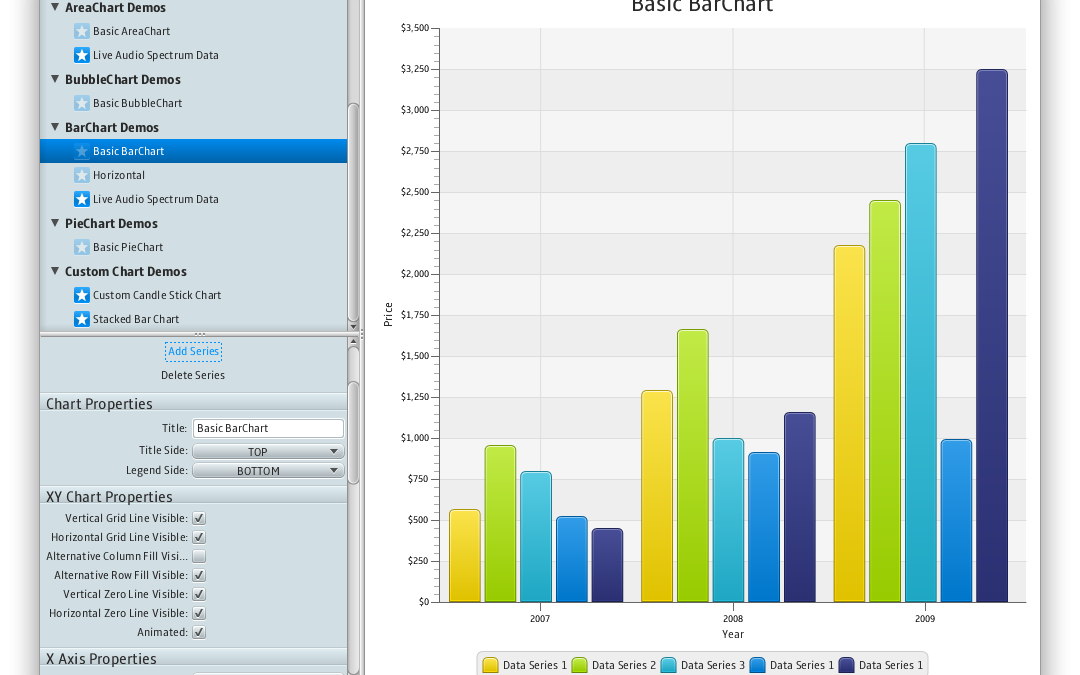
The screenshots are of the default widgets. The only question is which is the selected look-and-feel (for the "old" Swing toolkit), or the style sheet (in the new JavaFX).
On my Mac they look as close to native as any other app, which is to say that applications no longer have a uniform look anymore anyway. Chrome, Firefox, Twitter, my email client and all of my editors look no more "native" than modern Java apps like NetBeans or IntelliJ.
And what percentage of "all programming languages" is that?
No, there really aren't that many. Even fewer that are "professionally" usable. (I am not committing to Go's toolkit joining that latter set as I've not yet seen or used it.)
The font appears to be a refined version of Luxi Sans, which in turn is a refined version of Lucida Grande, which had been OS X's system font for 1.5 decades. Personally, I probably wouldn't call Bigelow and Holmes amateurs.
Elements of the proportional font, like the little foot on the 'a' remind me of Lucida Grande. Lucida Grade was the original OS X system font, which B & H also developed. This is not their first rodeo, its all about licensing.
The monospace is clearly an offspring of Lucida Typewriter. It is slightly condensed, a touch heavier, and with some obvious code-friendly variations (like a single-storey 'g' and a crossed zero) and a quirky, asymmetric curve inside the bowl of the 'b', 'd', 'g', 'p' and 'q' that I've instantly warmed to.
I'll give it a red hot go and develop in it for a day, but those chunky slab serifs are much busier than the Menlo I've preferred since 2009.
Definitely has a Lucida Grande feel to it, which, if I recall correctly, was one of the font on Plan9. The Go Mono isn't close to Lucida Grande Mono, but certainly looks like an interesting update.
Interestingly strange they wouldn't just choose an existing open source font that got along with their license. I guess even you've got Google's wallet behind you it opens a lot of doors.
It confuses me even more considering that Google is behind it. Google just announced fonts for all unicode characters. [1] Why create an extra font that will cause every app to look like a "Go" app instead of a native Windows/Linux/Mac app?
As I understand it, some of the main developers are being paid by Google to develop the language. The main page is also hosted by Google. Even though the language is technically open, that makes it a Google language for me. Not in a negative sense, it means that they should profit from it.
I still don't understand why they would have to license the Google fonts for testing and using them as standard fonts. EDIT: I just saw that Noto is available with an open license, just not the Go license. But I still think Google would relicense it to Go, seems like something Google would do in this case.
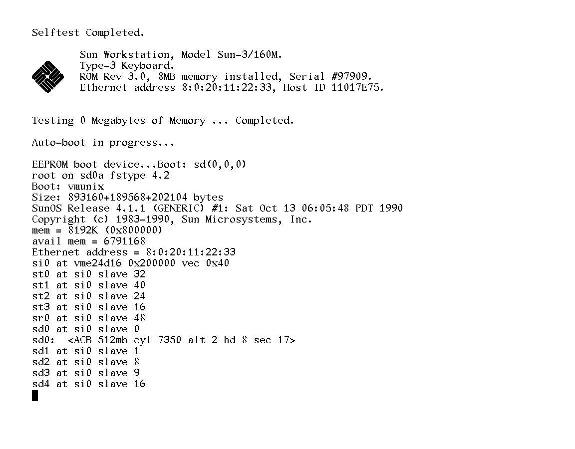
The monospace font reminds me of the console on old Sun workstations running SunOS.
It's pretty hideous. The alphanumerics feel rather slapdash, like this whole thing was put together by the foundary on a Friday afternoon and made to meet the minimum requirements but without much love.
But I think it's mostly to do with the non-uniform line thickness (look at the asymmetry of the 'x').
To me it looks better than the SunOS font, but it certainly does resemble it. That's probably why it looks "old" to me, and not in a particularly nostalgic way. Then again, I didn't use Suns all that much.
It's easy to fix though. Just pour more Knuthian bullshit on it until the hackers think its flaws represent important aesthetic decisions. It was made by an important type foundry adhering to the strictest mathematical principles, after all!
I've actually been trying to find a PCF or TTF variant of that Sun font. If anyone can point me to it, I'd be grateful. Maybe in some folder of opensolaris or illumos?
I love that they actually included Bigelow's explanation of each decision made. So often (especially in the realm of programming fonts, it seems) decisions on letter forms in new fonts seem to be made "because it looks nice", but there is, in fact, a science behind it all. Indeed, Go Mono ticks every item I look for in a programming font (one of only 2 or 3 programming fonts that does):
- slashed 0
- easy differentiation of 1, i, l, and |
- open lower-case g
- proper kerning and adequate width of r, n, and m
Unfortunately, I don't see myself switching away from Menlo to Go Mono for a silly and purely aesthetic reason: 5 point raised baseline * . Yes, yes...I know that's how pretty much every font has done * since forever, but after working with the vertically centered, six-pointed * in Menlo (and SF Mono), it's hard to go back.
Do you write OCaml or C (comments) by any chance? I've often found it hard to discover a typeface that has
(* this is a comment *)
vertically centered. My usual choice is Fira Mono because it looks great and centers * vertically, though I would love a serif monospace font. Maybe Go Mono will be revised but I doubt it will be updated anytime soon.
When you say "6 point" do you mean it's bigger than usual?
Is there a place to obtain SF Mono without an Apple Developer account if you don't happen to have a macOS installation handy?
I've found the vertically centered "" to be far superior almost everywhere. Definitely for comments, but even for pointers (yes, I do write a fair bit of C) it becomes clearer that the glyph is part of the type signature, and not just a footnote.
By "6 point" I mean the character itself has 6 "arms", instead of the typical 5. For my taste, it makes the glyph feel more balanced.
There is this repo: https://github.com/hbin/top-programming-fonts . Unfortunately, I'm not familiar with the legality of obtaining Menlo without OS X/macOS. It is a variation on Bitstream Vera Sans, which is AFAIK Open Source, but I am completely ignorant when it comes to how licenses apply to fonts (as opposed to code).
As for SF Mono, that seems to be impossible to obtain even if* you have macOS and an Apple Developer account (only the UI fonts are available for download). I managed to dig them out of the Xcode application bundle and install them as system-wide fonts, but was greeted with a very scary warning stating that installing these fonts could destabilize my entire system (so far my OS is still running, though)...YMMV.
pretty soon you will not be able to compile go without it being written in the correct font. thus making go code the same no matter where it is written or displayed!
Homoiconicity has more to do with code in language X being directly written syntactically and semantically as a convenient data structure manipulable in X. It does not have to do with consistency in appearance.
Roboto appears to be licensed under Apache 2.0. Noto under SIL Open Font license.
As these fonts are purportedly intended for testing purposes, presumably they will be included in the package. Adding additional licenses to the codebase complicates the usage. You might agree to the terms of the Go license, but not the Apache license, for instance.
Since this new font is licensed under the Go license, there is only one set of terms you need to agree to. This is a much better situation for many reasons.
Considering the openness of these licenses the concern is silly. The tiny disadvantage of having an extra open license is heavily outweighed by the much higher quality and unbeatable coverage of the Noto fonts.
Also, considering that Google owns Noto and has relicensed it in the recent past, it would probably be possible for them to ship it under the Go license too.
Unfortunately if you use Noto fonts with Go Rob Pike and Nigel Tao will hunt you down, show up to your house and kill you and your entire family, so you have to factor that in to your choice.
The monospace serif typeface has pleasant, natural thick-thin strokes, giving it a substantial, typewriter-y appearance instead of the weak lines in most monospace serif typefaces -- remember Courier New?
I see there's a black-on-white Gopher hiding at U+F800 in the middle of the BMP Private Use area (U+E000..U+F8FF). Besides that, only Latin, Greek, Cyrillic, and a few box drawing glyphs are provides. Are there any plans from the Go Fonts team to provide glyphs for all characters in the BMP, and beyond?
Exactly. On some other forums people complain like someone is forcing them to use it! I don't understand it at all. How does it affect their life in any way?
Don't like it? Don't need it? Move on with your life...
I was surprised to see that you didn't add any Go-specific code ligatures (e.g. for <- like Fira Code provides[1]).
Has there been any thought into providing a variant with some? While I could see why some might be against them I think they're rather fun and can make code more readable.
This is honestly where I thought this was going when I saw the title. It would be cool for a font to be invested in the language it's used to describe to the point where it supports features of that language.
I use Fira Code for JS, HTML, and CSS and it's great. Very rarely to the extra fun ligatures get in the way, and when they are printed they look absolutely gorgeous. I wish all/most code samples in tutorials and articles were set in it so they would be a pleasure to read.
There aren't that many places where Go's syntax would make such things useful. There's := and // for comments. A case could be made for [] to indicate slice. Reading over some code the only other one that seems to come up a lot is (), which is just "calling a function with no arguments" and I'm not sure I'd want that particularly distinguished. Comments are generally already color coded, so that really just leaves :=.
Although I could make a case for making :+ some sort of ligature that makes it obvious I just screwed up by holding SHIFT too long. :) You won't see it by scanning my code base, but I definitely type it a lot....
Because it's extra, unnecessary cruft. May as well throw in generics as well, and inheritance and may as well develop your own OS for go while you're at it.
As you can tell I think this is just a silly waste of time for a compiler. Non native applications are near universally ugly and poorly designed and adding a custom font is just another slap in the face.
> Because it's extra, unnecessary cruft. May as well throw in generics as well, and inheritance and may as well develop your own OS for go while you're at it.
False equivalences are fun. :-)
> As you can tell I think this is just a silly waste of time for a compiler.
But the people who did this have nothing to do with the compiler.
The font is ostensibly for the experimental UI, so that the font license would not encumber the code using the UI toolkit. That said, they did seem to put effort into making sure Go source code would look pretty.
I just got this set up on a Linux system and I think these fonts are absolutely fantastic. This is the only "programmer's font" I've tried that was ever any good.
I like them but they won't be replacing PragmataPro which has ligature support and works in everything I use, is nicely condensed without feeling cramped and is just beautiful to look at.
Screenshots: http://imgur.com/a/tiE76 first image is Pragmata second Go font, no contest for me.
I think these are made in preparation for high-DPI screens.
The serifs are short enough that I couldn't see them all on my regular screen (particularly the right-hand serif on the lowercase 'w'). But on my phone I would be able to see it perfectly well. On a high-DPI screen, the text isn't blurry or anything. They didn't focus on the rendering at all it seems, but made their screenshots in high resolution.
Fixed-width serif is exactly what I wanted! It's refreshing to be able to switch from serif to sans-serif, I do that on my Kindle about once a month and the text immediately becomes less boring.
This looks like an improved version of Luxi. I couldn't use Luxi Mono because O and 0 look the same, but this fixes that. I had been looking for a serif monospace font for a long time and this looks great.
Did anyone else try to use it in xterm or rxvt-unicode?
In xterm and Emacs the vertical spacing seems to be too small, making it look pressed together.
In rxvt-unicode the only problem is that the renderer displays it stretched horizontally like a short but wide block.
Yes, that's the Pragmata guy. I first paid for his font in January 2004, and he still sends out updates. (I did upgrade to Pragmata Pro in 2011, but still). He's been doing nifty program specific ligatures lately.
These look exactly like the Plan9 fonts (which IIRC were also by Bigelow&Holmes). Ironically, the Plan9 folk seem to shun TrueType in favor of bitmap fonts... I'm pretty sure the Raspberry Pi Plan9 image I'm running at my home office only has bitmap fonts installed.
Plan 9 uses Lucida Sans Unicode, which was the OS X system font (as Lucida Grande) until recently. There is a resemblance between this font and Lucida Sans Unicode, they come from the same foundry, after all, but they are significantly different.
> Ironically, the Plan9 folk seem to shun TrueType in favor of bitmap fonts.
It's true Plan 9 uses bitmap fonts, but that's just how the technology was implemented (so you could use BitBlt, etc), there is no shunning of trye type fonts.
I think the rendering is horrible too, with plenty of colour fringing and unevenness.
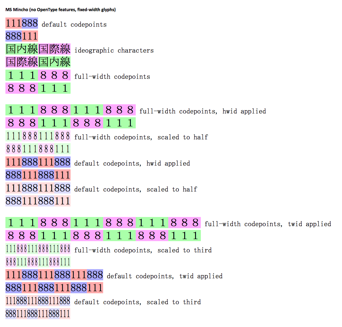
The monospace font reminds me of the generic "Asian product manual font" - although the individual shapes are slightly different, it has a similar feeling to MS Mincho:
The monospace is kind of okay, I guess, but considering the competition there's nothing special about it. Many users will be coding with colour keyword support anyway, so the idea that it's going to be super-great for Go code is strange.
I found the proportional font really hard to read.
It's a pity when newer typefaces don't have lighter weights — they look far better on high resolution displays than normal/regular weights, which look almost bold.
It's a matter of personal opinion of cause, but I find it extremely easy on the eyes. Some one else posted a screenshot with some code displayed using the Go font, and it's extremely readable, to me at least.
I love serifs and haven't found a good monospaced serif font yet. This one looks good but has some minor bugs like spacing and * not being centered vertically for the times you write OCaml or C comments. I'm trying it out anyway because I've been missing serifs in my terminal and editor for too long.
Another reason to not just use Google fonts is to make sure they do not - even if unwittingly - give an impression that the Go language is controlled by Google. This is an open source initiative (at least in spirit) and needs to make choices akin to its roots.
Whoa there. I was asking a question, somewhat incredulously. Maybe the person who wrote that comment is misinformed. Maybe they know something we don't.
Nowhere did I suggest they were 'JetBrains shills' and neither should you, unless you have some evidence of it.
In the UI options there's an option for GTK but I've just checked (both IDEA and PyCharm) and I think it's just a theme. I genuinely thought it was using GTK widgets.
I don't see an advantage over using native system fonts. As far as I know you don't need a license to use fonts installed on the system running the application. Why does the font need to be bundled? The wide spread adoption of this is going to make go programs stick out like a sore thumb.